pacman::p_load(ggrepel,ggthemes,hrbrthemes,rstatix,dplyr, gt,visNetwork, patchwork, tidyverse,lubridate,kableExtra,ggridges,plotly,gganimate,viridis,ggplot2movies,readxl, gifski, gapminder)Take Home Exercise 1
Instruction on Take Home Exercise 1
Data preparation
load necessary libraries
Read the CSV files
Read the CSV file “FinancialJournal.csv” and store the data in the variable “financial”. Suppress display of column types. Remove duplicate rows using unique() Apply abs() to amount column to remove negative sign for spending.
financial<- read_csv("data/FinancialJournal.csv",show_col_types = FALSE)
financial <- unique(financial)
#glimpse(financial,width=NULL)
financial$amount <- abs(financial$amount )

financial <- financial %>%
  mutate(
    year = year(timestamp),
    month = month(timestamp),
    weekdays = weekdays(timestamp),
    day = day(timestamp)
  )
Read the CSV file “Participants.csv” and store the data in the variable “participants”. Suppress display of column types. Remove duplicate rows using unique()
participants <- read_csv("data/Participants.csv",show_col_types = FALSE)
participants <- unique(participants)
#glimpse(participants,width=NULL)
Perform a left join on two tables
Perform a left join between the “financial” and “participants” data frames, matching rows by participantId. Preview of the “joined_data” as follow.
joined_data <- left_join(financial, participants, by = join_by(participantId   == participantId  ))
#glimpse(joined_data,width=NULL)
Check for missing data
Apply the function to calculate the sum of missing values (NA) for each column specified in the joined_data data frame. Number of missing value = 0 in all 10 columns. No missing value found.
Show the code
# Check for missing values using is.na()
missing_data <- is.na(joined_data)

# Check for missing values using is.na()
missing_data <- sapply(joined_data, function(x) sum(is.na(x)))

# Print the number of missing values per column
print(missing_data)
participantId timestamp category amount year
0 0 0 0 0
month weekdays day householdSize haveKids
0 0 0 0 0
age educationLevel interestGroup joviality
0 0 0 0 Removing outliers
Removed Participants with with not enough data points in FinancialJournal. Filtered out these participantId from all the original tables. Plot a histogram of the outlier participantId.
Show the code
# Calculate count data
count_data <- joined_data %>%
  count(participantId, name = "count")

# Calculate quartiles and IQR from count_data
q1 <- quantile(count_data$count, 0.25)
q3 <- quantile(count_data$count, 0.75)
iqr <- q3 - q1

# Define outlier cutoff values
lower_cutoff <- q1 - 1.5 * iqr
upper_cutoff <- q3 + 1.5 * iqr

# Filter out outliers from joined_data
filtered_data <- joined_data %>%
  inner_join(count_data, by = "participantId") %>%
  filter(count >= lower_cutoff & count <= upper_cutoff)

# Filter out outliers from participants
filtered_participants <- participants %>%
  inner_join(count_data, by = "participantId") %>%
  filter(count >= lower_cutoff & count <= upper_cutoff)

# Filter out outliers from financial
filtered_financial <- financial %>%
  inner_join(count_data, by = "participantId") %>%
  filter(count >= lower_cutoff & count <= upper_cutoff)

# histogram plot of participantId sorted by count
# added lines for upper and lower Cutoff
ggplot(count_data, aes(x = reorder(participantId, count), y = count)) +
  geom_bar(stat = "identity", width = 0.4) +
  geom_hline(yintercept = lower_cutoff, linetype = "dotted", color = "red")+
  geom_hline(yintercept = upper_cutoff, linetype = "dotted", color = "red")+
  annotate("text", x = Inf, y = lower_cutoff, label = paste("Lower Cutoff:", lower_cutoff),
           vjust = -1, hjust = 1, color = "red") +
  annotate("text", x = Inf, y = upper_cutoff, label = paste("Upper Cutoff:", upper_cutoff),
           vjust = 1, hjust = 1, color = "red") +
  xlab("Participant ID") +
  ylab("Count") +
  ggtitle("Sorted Histogram on Count of records by Participant IDs ")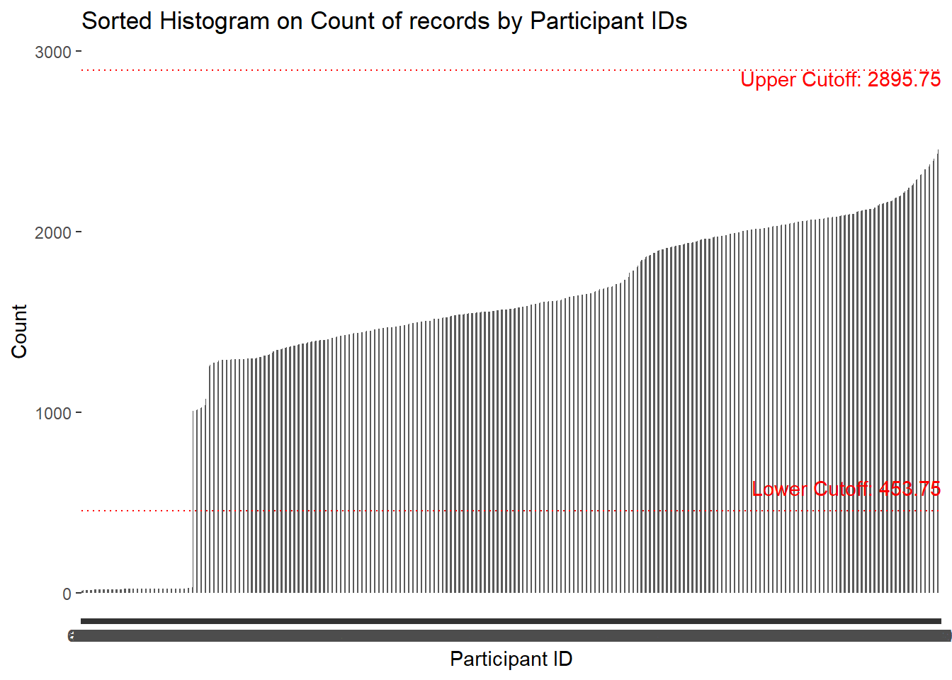
Transform using pviot_wider
transform financial data using pviot_wider by “category” Replace NA wil ‘0’ and added year, month, weekdays and date fields.
Show the code
transformed_financial<- filtered_financial %>%
  pivot_wider(names_from = "category",
              values_from = "amount",
              values_fn = list(amount = sum))

transformed_financial$count <- NULL
transformed_financial$Wage <- replace(transformed_financial$Wage, is.na(transformed_financial$Wage), 0)
transformed_financial$Shelter <- replace(transformed_financial$Shelter, is.na(transformed_financial$Shelter), 0)
transformed_financial$Education <- replace(transformed_financial$Education, is.na(transformed_financial$Education), 0)
transformed_financial$RentAdjustment <- replace(transformed_financial$RentAdjustment, is.na(transformed_financial$RentAdjustment), 0)
transformed_financial$Food <- replace(transformed_financial$Food, is.na(transformed_financial$Food), 0)
transformed_financial$Recreation <- replace(transformed_financial$Recreation, is.na(transformed_financial$Recreation), 0)

#transformed_financial <- transformed_financial %>%
#  mutate(
#    year = year(timestamp),
#    month = month(timestamp),
#    weekdays = weekdays(timestamp),
#    date = date(timestamp)
#  )

head(transformed_financial, 5) %>%
  kbl(caption = "Sample table after transformed") %>%
kable_classic_2(full_width = F)| participantId | timestamp | year | month | weekdays | day | Wage | Shelter | Education | RentAdjustment | Food | Recreation |
|---|---|---|---|---|---|---|---|---|---|---|---|
| 0 | 2022-03-01 | 2022 | 3 | Tuesday | 1 | 2472.508 | 554.9886 | 38.00538 | 0 | 0 | 0 |
| 1 | 2022-03-01 | 2022 | 3 | Tuesday | 1 | 2046.562 | 554.9886 | 38.00538 | 0 | 0 | 0 |
| 2 | 2022-03-01 | 2022 | 3 | Tuesday | 1 | 2436.915 | 556.5529 | 12.81245 | 0 | 0 | 0 |
| 3 | 2022-03-01 | 2022 | 3 | Tuesday | 1 | 2366.630 | 554.9886 | 38.00538 | 0 | 0 | 0 |
| 4 | 2022-03-01 | 2022 | 3 | Tuesday | 1 | 2456.687 | 1556.3562 | 12.81245 | 0 | 0 | 0 |
Visulization on the dataset
Distribution of participants data
Show the code
ggplot(data = filtered_participants) +
  geom_bar(mapping = aes(x = householdSize),color="grey25", fill="grey90")+
  theme_gray() +
  ggtitle("Distribution of householdSize")+
  theme_economist()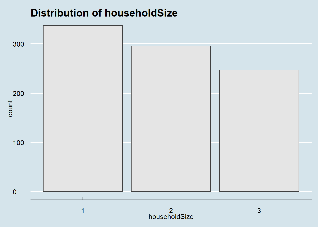
Show the code
ggplot(data = filtered_participants) +
  geom_bar(mapping = aes(x = haveKids),color="grey25", fill="grey90")+
  theme_gray() +
  ggtitle("Distribution of haveKids")+
  theme_economist()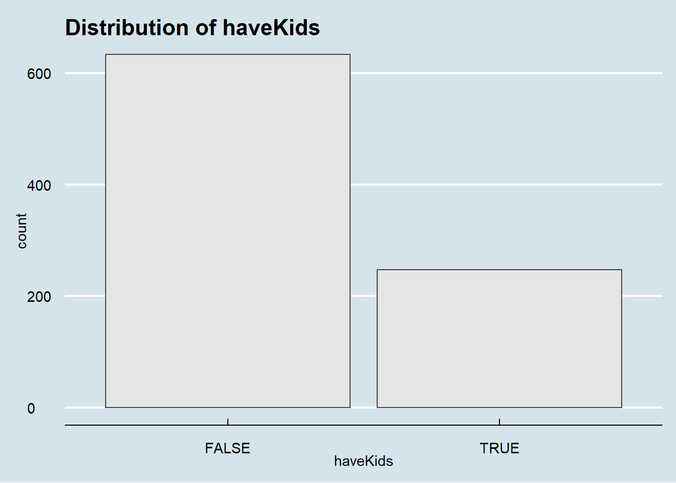
Show the code
ggplot(data = filtered_participants) +
  geom_bar(mapping = aes(x = educationLevel),color="grey25", fill="grey90")+
  theme_gray() +
  ggtitle("Distribution of educationLevel")+
  theme_economist()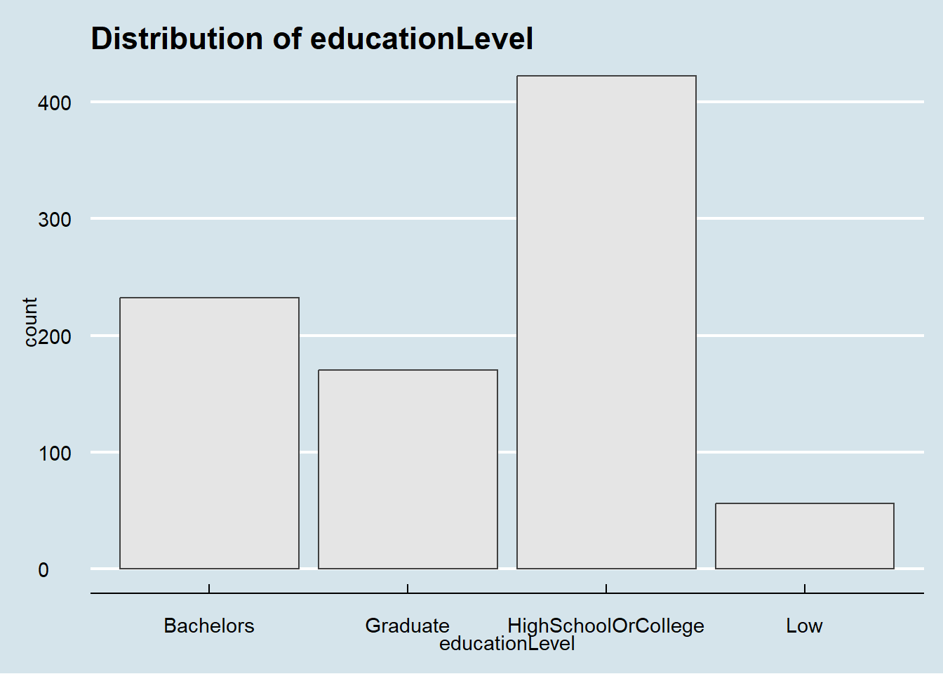
Show the code
ggplot(data = filtered_participants) +
  geom_bar(mapping = aes(x = interestGroup),color="grey25", fill="grey90")+
  theme_gray() +
  ggtitle("Distribution of interestGroup")+
  theme_economist()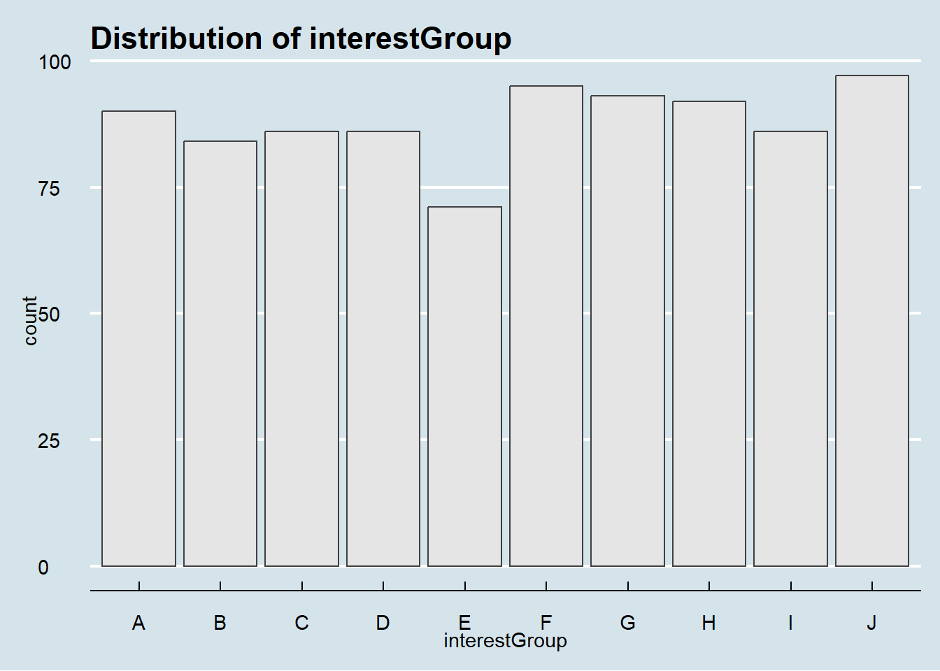
Distribution of financial data
Overview distribution of a continuous variable across multiple categories.
Show the code
ggplot(filtered_financial, aes(x = amount,color = category, y = category)) +
  ggridges::geom_density_ridges() +
  scale_x_log10(labels = scales::dollar)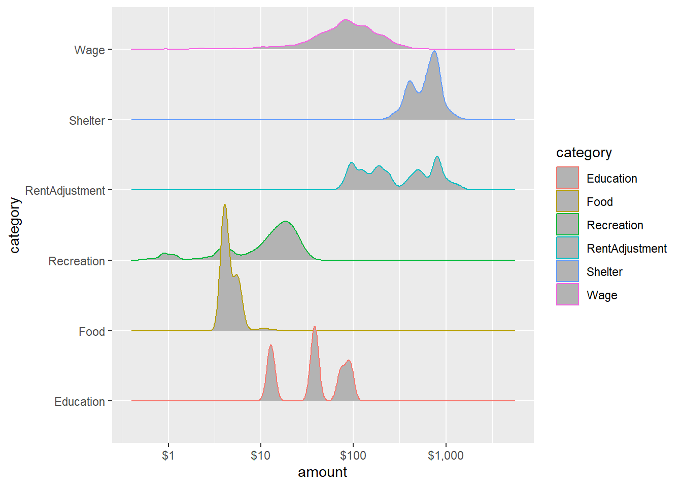
Interactive distribution summary in ggplotly.
Show the code
# Create the ggplot object
p <- ggplot(filtered_financial, aes(x = amount, color = category, fill = category)) +
  geom_density(alpha = .15) +
  scale_x_log10(labels = scales::dollar)

# Convert ggplot to plotly
p <- ggplotly(p)

# Display the interactive plot
p
Wage and Spending across 12 month
Monthly wage and spending consistent across all 12 month except RentAdjustment.
Show the code
ggplot(data = filtered_financial, aes(x = month, y = category, fill = after_stat(x))) +
  geom_density_ridges_gradient(scale = 3, rel_min_height = 0.01) +
  theme_minimal() +
  theme(legend.position="none",
  axis.text = element_text(size = 8)) +
  scale_fill_viridis() +
  transition_time(filtered_financial$month) +
  ease_aes('linear')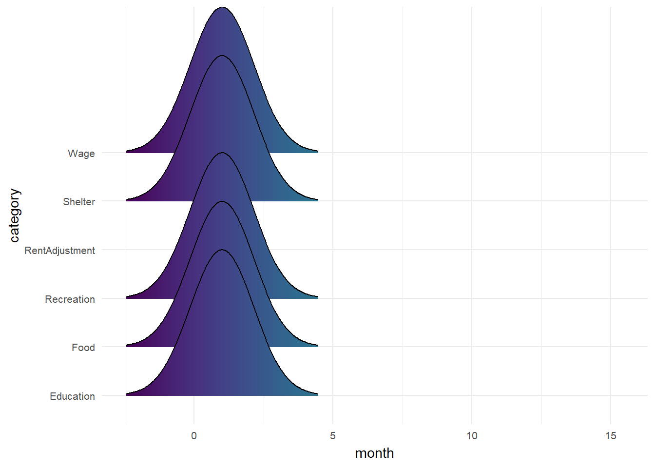
Spending for Recreation is usually higher on weekends. Spending for Shelter is usually on 1st or 2nd of each month.
Show the code
p1 <- ggplot(transformed_financial, aes(x = weekdays, y = Recreation)) +
  geom_bar(stat = "identity", width = 0.5) +
  xlab("Weekdays") +
  ylab("Total Spending on Recreation") +
  ggtitle("Spending on Recreation by Weekday ")+
  theme(axis.text.x = element_text(angle = 90, vjust = 0.5, hjust=1))

p2 <- ggplot(transformed_financial, aes(x = day, y = Shelter)) +
  geom_bar(stat = "identity", width = 1) +
  xlab("Day") +
  ylab("Total Spending on Shelter") +
  ggtitle("Spending on Shelter by Day ")

p1+p2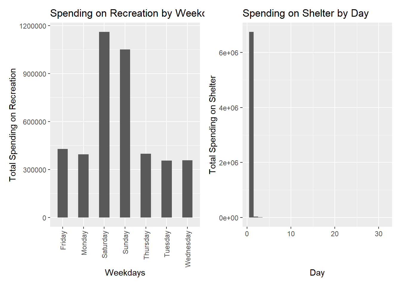
InterestGroup vs categorical variables
HighSchoolOrCOllege are majority in all interest group.
Show the code
filtered_participants %>%
  count(interestGroup,educationLevel) %>%
  ggplot(mapping = aes(x = interestGroup, y = educationLevel)) +
    geom_tile(mapping = aes(fill = n))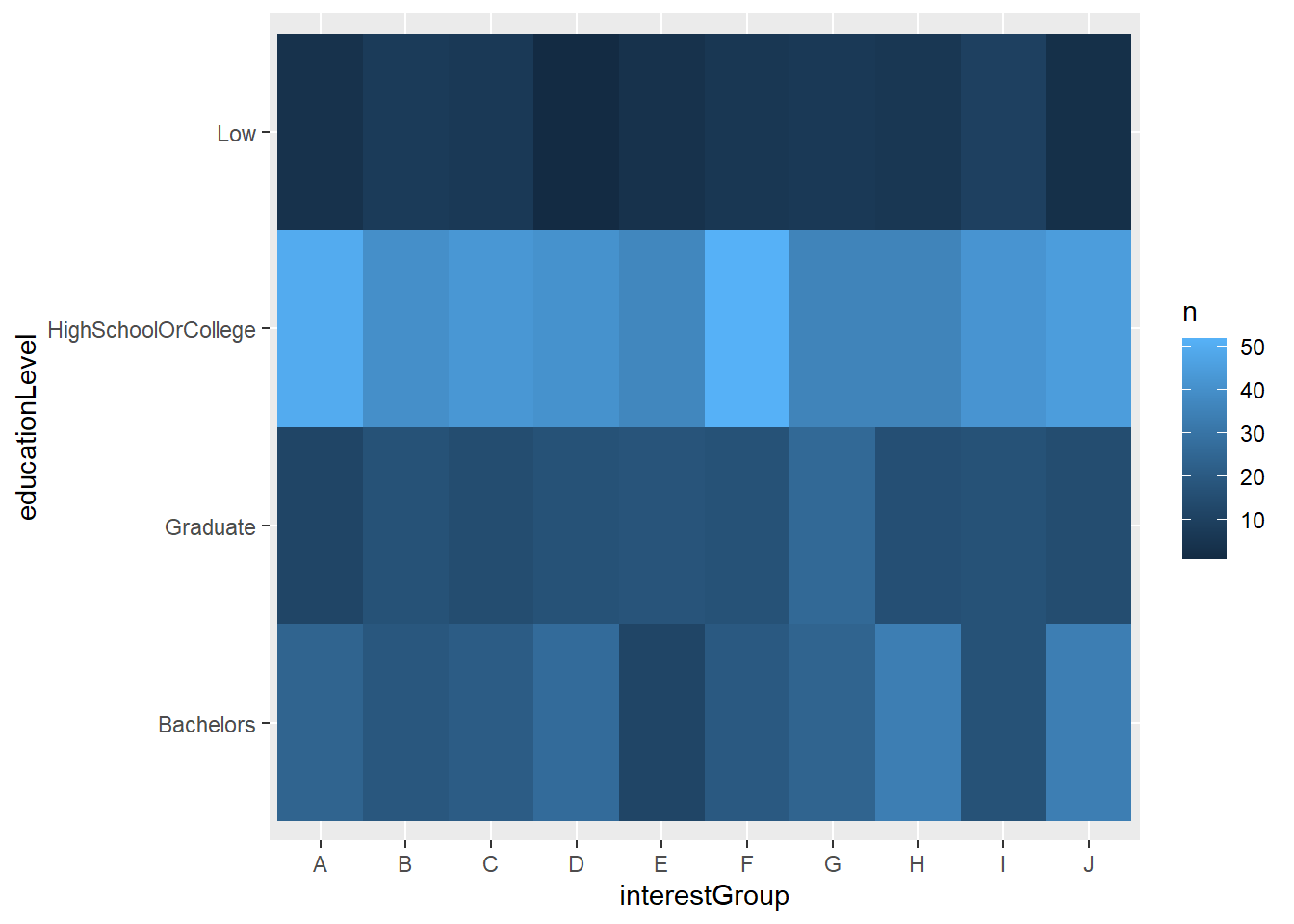
Most don’t have kids.
Show the code
filtered_participants %>%
  count(interestGroup, haveKids) %>%
  ggplot(mapping = aes(x = interestGroup , y = haveKids )) +
    geom_tile(mapping = aes(fill = n))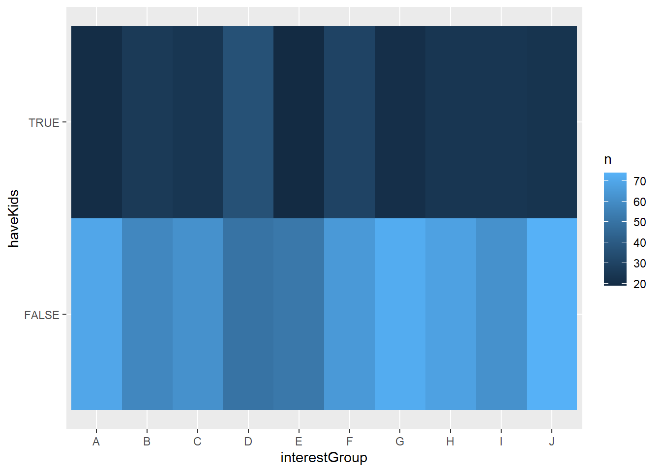
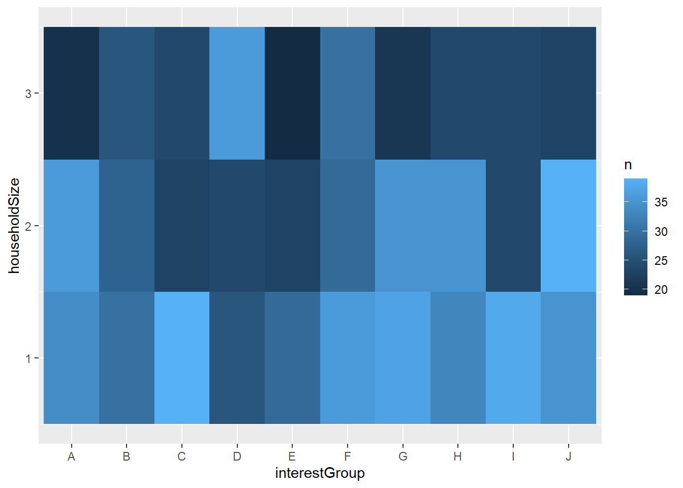
And group D mostly have 3 people in their household
Show the code
filtered_participants %>%
  count(interestGroup, householdSize) %>%
  ggplot(mapping = aes(x = interestGroup , y = householdSize )) +
    geom_tile(mapping = aes(fill = n))